Blog Design For Beginners: Create a Stunning Site in 2024

Struggling to make your blog stand out in a sea of content? I’ve been there. When I launched my first blog, it looked like a digital mess.
Did you know that 38% of people will stop engaging with a website if the content or layout is unattractive? (Source: HubSpot)
That’s why mastering blog design for beginners is crucial.
A good blog design is not only about looking pretty or having a fancy-looking theme. It’s about creating a space that keeps readers coming back for more.
Whether you’re starting your blog or looking to give your existing one a facelift, this guide will walk you through all the design essentials.
From choosing the right platform to implementing engaging design elements, I’ve got your back.
And trust me, the benefits of getting this right are huge. A well-designed blog can boost your credibility, keep readers on your site longer, and even improve your search engine rankings.
Here’s what you are going to learn:
🎨 Learn essential blog design principles for beginners
💻 Discover how to choose the right blogging platform
🖼️ Master the art of creating eye-catching headers and logos
📱 Ensure your blog looks great on all devices
🚀 Boost engagement with smart design elements
So, ready to transform your blog from blah to brilliant? Let’s dive in and discover how to create a blog design that truly resonates with your audience.
Understanding the Basics of Blog Design

You know that feeling when you land on a blog and everything just clicks? The layout makes sense, you can read the text without squinting, and you don’t feel lost. That’s good blog design doing its job.
I remember when I started my first blog. I spent way too much time fiddling with every little detail.
Looking back, I realize that a good blog design isn’t about getting everything perfect right away. It’s about making a space that feels right for your readers and can grow as you do.
So what makes a blog design good? It’s all about making things easy and enjoyable for your visitors.
Think of your blog like a comfy living room.
You want cozy seating (text that’s easy to read)…
A clear path to the kitchen (simple navigation)…
And a nice vibe (visuals that look good)…
When people feel at home, they’ll stick around longer.
Here are some key things that make a blog design work:
- A clean, uncluttered look
- Fonts that are easy to read
- A design that looks good on phones and computers
- I recommend a simple, clean white background with a black font
- Enough space so things don’t feel cramped
- Colors and images that match your blog’s personality
But watch out for these common mistakes:
- Making your menu too complicated
- Using too many different fonts or colors
- Slow-loading pages (people hate waiting!)
- Forgetting about how it looks on phones
I have made mistakes in choosing the right colors for my blog. Remember, your blog design can change over time. The important thing is to start with the basics and build from there.
Wondering how to pick the right platform to build your blog on? Because a blog design also depends on the platform you choose. Let’s talk about that next.
Choosing the Right Platform for Your Blog
Picking the right blogging platform is like choosing a good foundation for your house. It sets you up for success from the start.
I used Blogger in the beginning because it was simple. But as I grew, I realized it had limits. That’s when I switched to WordPress, and it opened up a whole new world of possibilities.
Popular platforms for beginners include:
- WordPress.org
- Wix
- Squarespace
Let’s break down the pros and cons:
WordPress.org:
Pros:
- Full control over your site
- Tons of themes and plugins
- Great for SEO
Cons:
- Steeper learning curve
- You need to handle hosting
Wix:
Pros:
- Easy drag-and-drop editor
- All-in-one solution
Cons:
- Limited customization
- Can be pricey for advanced features
Squarespace:
Pros:
- Beautiful templates
- Easy to use
Cons:
- Fewer plugins and customization options
- Can be expensive for beginners

When picking a platform, you should think about:
- How tech-savvy you are
- Think about your budget
- How much you want to customize your site
- Your long-term goals
I chose WordPress.org because I wanted full control. Here’s a quick guide to set it up:
- Choose a hosting provider
- Install WordPress (most hosts have a one-click install)
- Pick a theme (more on this in a bit)
- Customize your settings
- Start creating content!
For a detailed walkthrough, check out my beginner’s guide to WordPress. It’ll help you get up and running in no time.
Now that you’ve got your platform sorted, let’s talk about making it look good. Ready to pick a theme that fits your style?
Selecting a Theme That Fits Your Brand
Think of your blog theme as your site’s outfit. It needs to look good, feel comfortable, and match your style.
I went through so many themes trying to find the perfect one. But I ended up wasting so much time and resources.
But here’s what I learned when I shifted to WordPress, that the best theme is one that makes your content shine.
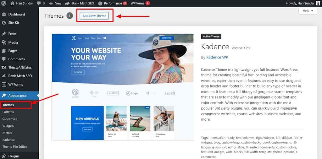
Themes play a big role in blog design. They determine:
- How your blog looks
- Where things are placed on the page
- How easy it is to navigate
When choosing a theme, ask yourself:
- Does it fit my blog’s topic?
- Is it easy for readers to use?
- Is it lightweight and has a fast loading time?
- Does it look good on phones and computers?
- Can I customize it to match my brand?
I made a minimum viable site that has a good-looking theme and a fast loading time.
I focused more on creating high-quality content than making everything perfect on my site. Because I know that I can update my site and theme at any time I want.
Now, about free vs. premium themes. Free themes are great when you’re just starting. I started with a free theme.
But as you grow, you might want more features. That’s where premium themes come in. I use the Kadence theme because it’s fast and I can make it look exactly how I want.

Here’s a quick comparison:
Free themes:
- Cost: $0
- Basic features
- Limited support
Premium themes:
- Cost: Usually $50-$200 or a subscription model
- More features and customization options
- Better support and updates
Whichever you choose, make it your own. Change colors, add your logo, and play with layouts. Your theme should feel like “you” when you’re done.
Ready to make your blog stand out even more? Let’s talk about creating a header and logo that grabs attention.
Crafting an Eye-Catching Header and Logo
Your blog’s header and logo are like your digital handshake. They’re often the main thing visitors see, so you want to make a good impression.
I use a simple logo for my blog. A good logo can help people remember you.
Creating a strong visual identity doesn’t have to be hard or expensive. There are plenty of DIY tools out there for beginners.
I use Canva and it’s pretty great for making logos and infographics. Other options include Looka and Tailor Brands.
Here are some tips for creating a memorable header:
- Keep it simple, don’t try to cram too much in
- Use colors that match your blog’s theme
- Make sure it looks good on both big and small screens
When it comes to placing your header and logo, think about what people see first when they land on your page.
Usually, the top left corner is a good spot for a logo. For sizing, make sure it’s big enough to see clearly but not so big that takes the full header section.
Remember, your header and logo are part of your blog’s personality. Have fun with it, but keep it clear and easy to read.
Now that we’ve got your blog looking good up top, let’s talk about making the rest of it easy to use.
Optimizing Your Blog’s Layout and Navigation
Did you know that visitors typically decide whether to stay on a website within 10-20 seconds? (Source: originalbox.co)
That’s why having a good layout and easy navigation is so important. When I first started blogging, my site was a mess.
But over time, I learned how to organize things better, and it made a big difference in how long people stuck around.
Here are some key principles for effective blog layout:
- Keep it clean and uncluttered
- Use a consistent style throughout
- Make important stuff easy to find
Creating an intuitive navigation menu is crucial. Think of it like a map for your blog. Here’s what I’ve found works well:
- Use clear and simple labels
- Limit main menu items to 5-7
- Put your most important pages in the main menu
Categories and tags are super helpful for organizing your content. They’re like filing cabinets for your posts.
I use categories to organize my blog posts and tags for more specific themes. This makes it easier for readers to find related content they might like.
Don’t forget about the search!
Adding a search function to your blog can be a game-changer. It helps readers find exactly what they’re looking for, even if it’s buried in an old post.
We’ve covered the basics of layout and navigation, but there’s more to making your blog easy on the eyes.
Now, get ready to dive into the world of fonts and typography.
Mastering Typography for Readability
You might not think much about fonts, but they can make or break your blog’s readability.
I used whatever font looked cool. Big mistake! I learned that what looks good isn’t always easy to read.
Choosing the right fonts is like picking the right shoes – they need to look good and feel comfortable.
For blogs, stick to clean, simple fonts. I like using the Poppins font for headlines and Arial font for body text. It’s simple, neat, and works well.
When pairing fonts, think of it like matching clothes. You want them to go together, but not be too matchy-matchy.
A good rule is to use one font for headlines and another for the main text.
Size matters too. For body text, aim for 16-18px. Any smaller and people will squint. For line spacing, 1.5 times your font size is a good starting point. It gives your words room to breathe.
Typography can also help create a visual hierarchy. Use bigger, bolder fonts for important stuff, and smaller fonts for less important things.
I use the Hemingway App to check my text’s readability. It’s super helpful for making sure everything is easy to read.
Now that we’ve got your words looking good, let’s talk about making your blog colorful in the right way.
Incorporating Color Psychology in Your Design
Colors aren’t just pretty – they can affect how people feel about your blog.
Did you know that people make up their minds about a product within 90 seconds of seeing it, and up to 90% of that decision is based on color? (Source: colorcom.com)
That’s why picking the right colors for your blog is so important.
Don’t complicate understanding the color basics. Here’s a quick rundown:
- White: simplicity, new beginning, cleanliness
- Red: exciting, passionate
- Blue: trustworthy, calm
- Green: natural, growth
- Yellow: happy, optimistic
- Purple: creative, luxurious
When choosing colors for your blog, think about what your blog is about. A tech blog might use blues and grays for a professional look.
And a food blog might use warm reds and yellows to make people hungry.
Use color to guide your readers’ eyes. Want them to click a button? Make it stand out with a bright, contrasting color.
There are some great tools out there for playing with color. I like using Adobe Color or Coolors to create color schemes. They make it easy to find colors that look good together.
Remember, less is often more with color. Pick 2-3 main colors and stick with them. It’ll make your blog look more put-together.
Also, sticking with the same color schemes for your social media helps you create a brand around your blog.
We’ve covered fonts and colors, but there’s more to making your blog visually appealing. Ready to start using images and graphics to make your blog pop?
Enhancing Your Blog with Images and Graphics
A picture is worth a thousand words, right? Well, in blogging, it might be worth even more.
Studies show that articles with images get 94% more views than those without. When I started adding more visuals to my blog posts, I saw my engagement numbers jump up.
Using images isn’t just about making your blog pretty. It’s about helping your readers understand and remember your content better.
Plus, it breaks up big chunks of text, making your posts easier to read.
Finding good images doesn’t have to cost a fortune. There are lots of places to get high-quality, free images.
I like using sites like Unsplash and Pexels. Just make sure you give credit when it’s needed.
But, don’t always use stock photos, they will make your site unprofessional. So, create your graphics to make your blog stand out.
I use Canva for making simple infographics or quote images. It’s easy to use, even if you’re not a designer.
When adding images to your blog, keep these tips in mind:
- Compress your images to keep your site fast
- Use descriptive file names and alt text for SEO
- Place images near relevant text
- Don’t overdo it – too many images can be distracting
Remember, the goal is to enhance your content, not overshadow it. Use images that add value and help tell your story.
Now that we’ve got your blog looking good on desktop, let’s make sure it looks just as great on phones and tablets.
Designing for Mobile Responsiveness
Over 50% of web traffic worldwide comes from mobile devices.
If your blog doesn’t look good on phones, you’re missing out on half your audience.
When I first started blogging, I ignored and only cared a little about mobile design. Please, don’t repeat my mistake!
Mobile-friendly design isn’t just nice to have – it’s essential. Google even uses mobile-friendliness as a major ranking factor.
So if you want your blog to appear in search results, you need to think mobile.
Here are some key principles for responsive blog design:
- Use a flexible grid layout
- Make sure the text is readable without zooming
- Avoid using large images that slow down loading
- Use easier-to-tap buttons
Testing your blog’s mobile responsiveness is crucial. I use Google’s Mobile-Friendly Test tool regularly. It’s free and gives you a quick yes or no on whether your site is mobile-friendly.
Remember, a good mobile experience isn’t just about shrinking your desktop site. It’s about rethinking how your content works on a smaller screen.
We’ve covered the basics of blog design, from choosing a platform to making sure it looks good on mobile.
But there’s one more crucial element to consider.
How do we turn all this great design into actual engagement with your readers? Let’s explore that next.
Implementing Essential Design Elements for Engagement
Did you know that brands can increase sales by over 35% just by changing the color of the CTA button?

When I learned that, I started paying a lot more attention to these little details.
Let’s start with the call-to-action (CTA) buttons. These are like signposts telling your readers what to do next.
Want them to sign up for your newsletter? Make a big, bright button that says “Join Now!” Put it where people can easily see it, like at the end of your posts.
Sidebars can be super useful, but they can also be a mess if you’re not careful. I used to cram mine full of stuff, but now I keep it simple.
A short bio, a search bar, and maybe your most popular posts. That’s usually enough. Or, you can also use the sidebar to display the table of contents for your blog posts.
Social media buttons are a must these days. Make it easy for people to share your content. I put mine at the top and bottom of each post.
Just don’t go overboard – pick the 3-4 platforms your readers use most.
As I told you before, here’s something a lot of people forget: white space. It’s the space around your content, and it’s super important.
It gives your readers’ eyes a break and makes your content easier to read. Don’t be afraid of space – it’s your friend!
The goal is to make it easy and fun for people to interact with your blog. Keep things simple and clear, and you’ll see your engagement go up.
Now that we’ve covered all these design elements, let’s wrap up and get to the final words.
Conclusion
We’ve covered a lot of ground in our journey through blog design for beginners.
You now have the tools to create a blog that not only looks great but also keeps your readers coming back for more.
A good blog design is an ongoing process. As you learn to blog and grow your audience, don’t be afraid to tweak and adjust your design.
Listen to your readers, keep an eye on your analytics, and always be open to improvement.
The benefits of blogging are numerous, but a well-designed blog can amplify these benefits tenfold. It helps you build a brand, establish your credibility, and even boost your search engine rankings.
Now, it’s time for action. Take one element we’ve discussed—maybe it’s creating a new logo or reorganizing your navigation menu—and implement it on your blog today.
Also, I recommend reading Atomic Habits by James Clear. It showed me that how small improvements and small tweaks lead to big improvements.
Don’t let this guide gather digital dust. Bookmark this post and refer back to it as you continue to refine your blog’s design.
And remember, the most important thing is to start. Your blog design is waiting to be created.
So, what are you waiting for? Let’s make your blog shine!
FAQs: Blog Design For Beginners
How do I choose the right color scheme for my blog?
Start with your brand colors or pick a palette that fits your niche. Use tools like Coolors or Adobe Color to find complementary shades. Stick to 2-3 main colors and use them consistently throughout your blog.
What’s the best font size for blog content?
Aim for 16-18px for body text. Anything smaller can be hard to read, especially on mobile. For headings, go bigger – around 24-30px for H2s. Always test your font sizes on different devices to ensure readability.
Do I need a logo for my blog?
A logo makes your blog memorable. It doesn’t have to be fancy – even a simple text-based logo can work. Use free tools like Canva to create one. Just make sure it’s clear and fits your blog’s style.
How can I make my blog mobile-friendly?
Use a responsive theme, keep your design simple, and test regularly on different devices. Make buttons and links easy to tap on mobile. Compress images to improve load times. Consider using Google’s Mobile-Friendly Test tool to check your site.
Is it worth paying for a premium theme?
It depends on your needs. Free themes can work well when starting. But premium themes often offer more customization options and better support. If you’re serious about blogging, a premium theme can be a good investment down the line.
How often should I update my blog’s design?
There’s no fixed rule, but aim to refresh your design every 1-2 years. This keeps your blog looking current and gives you a chance to implement new features. But don’t change too often – your readers need to recognize your blog!
What’s the most important design element for a blog?
Readability is key. Clear fonts, good contrast, and enough white space make your content easy to consume. After that, focus on intuitive navigation. Your readers should always know where they are and how to find what they need.


